Florence Nightingale and visual statistics
Who was Florence Nightingale? I suspect this would be a £100 Who wants to be a millionaire question; and maybe for £2,000, what was she famous for? She was (b 1820 d 1910) a nurse made famous for serving in the Crimean War (1853-1856), best known as 'the Lady of the Lamp' after her habit of making rounds at night.
Less well known, though, was that she became, in 1859, the first female member of the Royal Statistics Society, being a pioneer in the presentation of information by pie charts and other means. Her most famous presentation was the Coxcomb diagram of causes of death in the Crimean war.
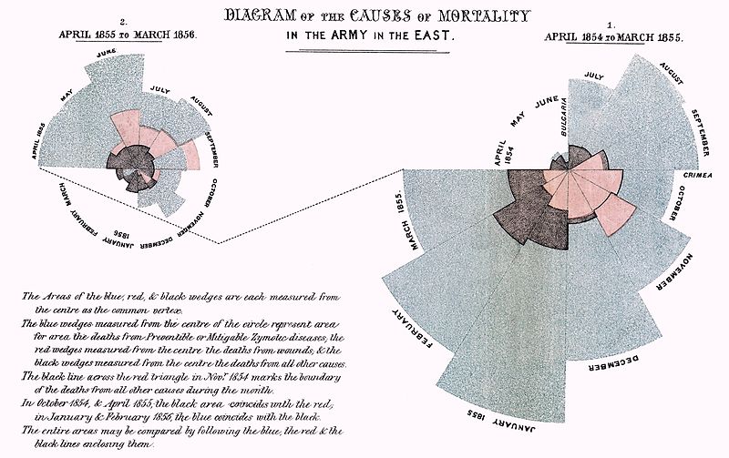
The words in the diagram below are rather too small to read, but the large blue-grey areas are the deaths from preventible or mitigable Zymotic diseases. (Zymotic being a term used in medicine from 1839 when there was less knowledge of infections etc).
Tim Harford, one of my favourite Tweeters, wrote an article at FT.com on misinformation. He ends it with:
Those beautiful Coxcomb diagrams are no exception. They show the causes of mortality in the Crimean war, and make a powerful case that better hygiene saved lives. But Hugh Small, a biographer of Nightingale, argues that she chose the Coxcomb diagram in order to make exactly this case. A simple bar chart would have been clearer: too clear for Nightingale’s purposes, because it suggested that winter was as much of a killer as poor hygiene was. Nightingale’s presentation of data was masterful. It was also designed not to inform but to persuade. When we look at modern data visualisations, we should remember that.
Quite right: the Coxcomb diagrams over-emphasise to our eyes what Florence wanted people to see. Perhaps she was the world's first spin-doctor?
