Size is everything
Or is it?
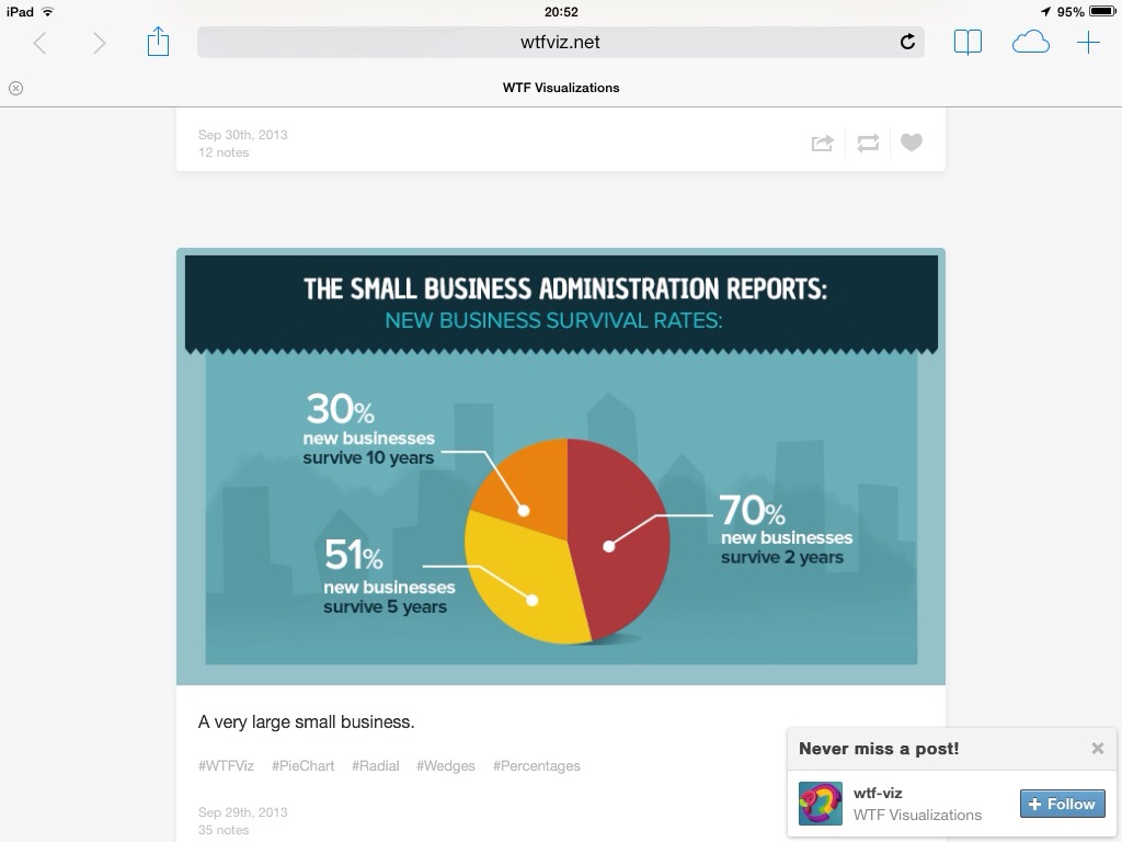
If I were to name my favourite person whom I follow on Twitter, it is the economist Tim Harford. I am interested in most things that he writes about. One of these is that he often tweets about WTF Visualizations, a site which publicises bad usage of graphs to set out data.
I was interested in this billboard which is being run at various sites around Manchester at present.

(Alas, this is the best print I can get- the ad doesn't seem to be available on the Internet. Hopefully though it is clear enough to be legible). It purports to show that the advertister's site is twice as good as its big three competitors- I say twice, being an approximation based on height. Being less charitable to the advertiser, maybe it is trying to mislead the eye into thinking their site is three or four times the competitors (by square area) or being even less heritable, some cubic power, if the 'volume' of the vehicles are to be inferred.
The advert has small print saying where the data was sourced from, and where to go for more information, so I did just that. Their text is shown below, as is my bar chart showing the information more fairly.
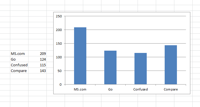
Yes, the advertiser comes out clear first based on the sample studied, but not to the extent which the eye is meant to read. In addition, the relative size of the others is also not entirely accurately stated.
I appreciate that the comparison site graphics aren't as misleading as the pie chart at the start of this blog, but they are at least to some extent.
An independent research agency, IPSOS Mori, independently created and validated the research method and carried out the research. The research consisted of 591 real consumers genuinely in the market for car insurance between May and July 2013. This survey was a representative sample of real consumers aged 18-65 years old. Consumers used all of the 4 leading price comparison websites (
,
,
and
) to obtain quotes for their car insurance. Each consumer used the 4 websites on the same day, using the same personal details, the same voluntary excess and payment approach etc. Those consumers who used all 4 leading price comparison websites were asked in a questionnaire 'Which Comparison site supplied the cheapest quote to you today?' with the results based on the answer to this question. The following shows the number of consumers who found the cheapest quote on each of the 4 leading price comparison websites between May and July 2013.
= 209 customers,
= 143 customers,
= 124,
= 115, total = 591.
